Non Profit App Development – Case Study – Remote Offered Skill Building App (ROSA)
Grey Chain engagement with International Rescue Committee began in 2017 right at the inception of the firm, since then the ROSA app has moved from just an idea to a product helping Gender Based Violence (GBV) victims in remote areas globally.
One of the key requirements for ROSA app was to have offline learning and development content availability so that the users can download the app once and then consume the content at their convenience because the target user base had limited internet availability.
After helping 1000s of victims and case workers for 2 years, a lot of user research was conducted based on end user feedback, App analytics and IRCs objectives especially in 2020 when Covid has made it difficult for GBV actors to seek help.
UX research played a key role in identifying and documenting each user challenge and based on brainstorming workshops each challenge was solved using new UX Strategy and Digital Transformation for the mobile apps.
Challenge – Entry Barrier for Users
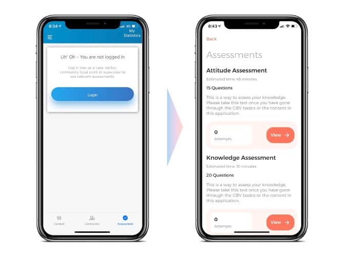
The current app requires users to login because some of the content like Assessments have Case worker scores to be sent to their supervisors as a summary, but seemed to be the biggest deterrent for users to even use assessments primarily because a feature like login will require an internet connection.
Solution – After inputs from the supervisors and users and based on our experience with non profit app development, it was determined that the assessments needs to be without login and the focus should be on ease of use and independent assessments with the trust that case workers are responsible to submit their assessments using methods like Whatsapp or other messenger apps. The app now has a secure method to store assessments locally and then share a proof of result with score easily over these messenger apps.

Challenge – Redesign for Accessibility
User feedback is the most important thing for any technology based product. The existing users were struggling with small fonts, non-contrasting colors and less intuitive navigation.
Non Profit app development research had led to multiple revelations for Grey Chain UX Center of Excellence over the years and this has helped us deliver a robust UX for multiple non-profits such as UNCIEF, AIACA and many others.
Solution – We developed methods to solve for drastically improving accessibility like
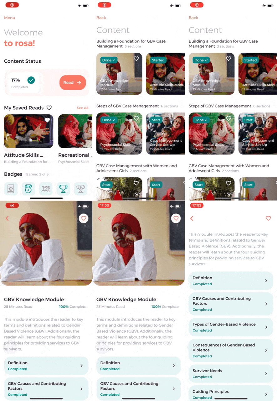
- Bigger Fonts – Designed bigger fonts while still showcasing same amount of content on the screen
- Color Palette Test – Use color accessibility testing tools to pick good contrasting colors for each button, accent and text.
- Single Page Navigation – Changed Navigation to bring everything to the home screen, so that everything can be discovered and reached using a single scroll.
- Image based UI – Use a lot of images to showcase content and motivate the end user to explore instead of monotonous content sections.

Challenge – Less motivated user to read text based content
In today’s day and age of video and audio content, users are less and less motivated to read textual content. ROSA content is available in multiple languages but its mostly text for the end users to go through. In order for the users to complete the sections, it was required to add some intrinsic motivations in the app.
Solution – GAMIFICATION!!
Along with IRC’s Product Owner (PO) we were able to determine badges which can motivate users to complete the content as early as possible and to a higher extent that before.
Using App Analytics, targeted scorecard badges were developed for e.g.
- Badge for visiting the app consecutively for 5 days in a row to convert it into a habit
- Badge for all levels of module completion from Student Level 1 to Student Level 17!
- Badges for attempting as well as acing assessments motivating users to study more and retry tests.
Challenge – Large App Package acting as deterrent for First time users
One of the key objectives as mentioned earlier was offline content which meant pre-loading app video and audio content in the app package, this bloated the package to 1 GB leading to users not downloading the app sometimes or having to drop the download due to internet connection issues. This was primarily because despite each user using only one language each language content was preloaded leading 4x size increase than what it should have been.
Solution – Our technical team in their architecture led planning sessions arrived at a method where the app could be just 40MB accompanied by a on demand 120 MB audio/video package that the user requests and downloads in 10 seconds only when he/she reaches the content.
Apart from solving for UX, there were a lot of technical enhancements done from ground up. For e.g. moving away from Native Android and iOS and adopting Google latest app development standard – Flutter.
Benefits of Flutter based app development delivered to IRC were:
-
Faster Development Cycle
-
Single Code base for both Android & iOS
-
Consistent UI irrespective of the device type
-
Ease of upgrades for addition of more languages like Burmese
-
Faster feedback incorporation
At Grey Chain, we believe in “Partnering to bring ideas to reality” and the team at IRC have always worked closely with us to explore new ideas, iterate by following agile principles and believing in our capability to deliver. We are proud partners and continue to partner on taking ROSA to the next level.
If you are looking for Non Profit App Development, feel free to reach out to me on Linkedin.

 Get in Touch

